
Styling
Style sheets for boards and controls, written in C# and laid out like CSS: rules pick tiles and controls by type, class and state, the cascade weighs origin before specificity, colours come from theme tokens, and a change of state blends over a transition.
Preview Part of ArionUI Core (ArionUI.Presentation). There is no CSS parser and no text format: a style sheet is a C# object, so the compiler checks every property name and value.
A style sheet
A StyleSheet is a list of rules, each a selector and an ArionStyle. It is written with a collection initializer and given to a board; the boards inside its tiles inherit it.
using ArionUI.Presentation.Controls; // StyleSheet, Select, ArionStyle, Tokens, ArionTransition

board.StyleSheet = new StyleSheet
{
    { Select.Class("kpi"), new ArionStyle { Transition = ArionTransition.Standard } },
    {
        Select.Class("kpi").Hover, new ArionStyle
        {
            Lift = 3,
            BorderColor = Tokens.Accent,
            Shadow = Tokens.Accent.WithAlpha(0x77),
            ShadowBlur = 6,
        }
    },
    { Select.Class("kpi").Hover.Pressed, new ArionStyle { Lift = 1, ShadowBlur = 3 } },
    { Select.Type<Button>().Class("primary"), new ArionStyle { CornerRadius = 12 } },
};
Every property of ArionStyle is optional: a style sets only what it names, and the cascade lays the matching styles over each other, property by property.
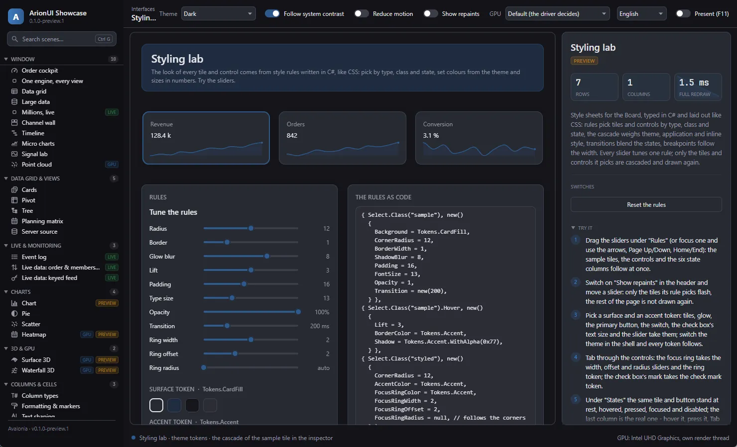
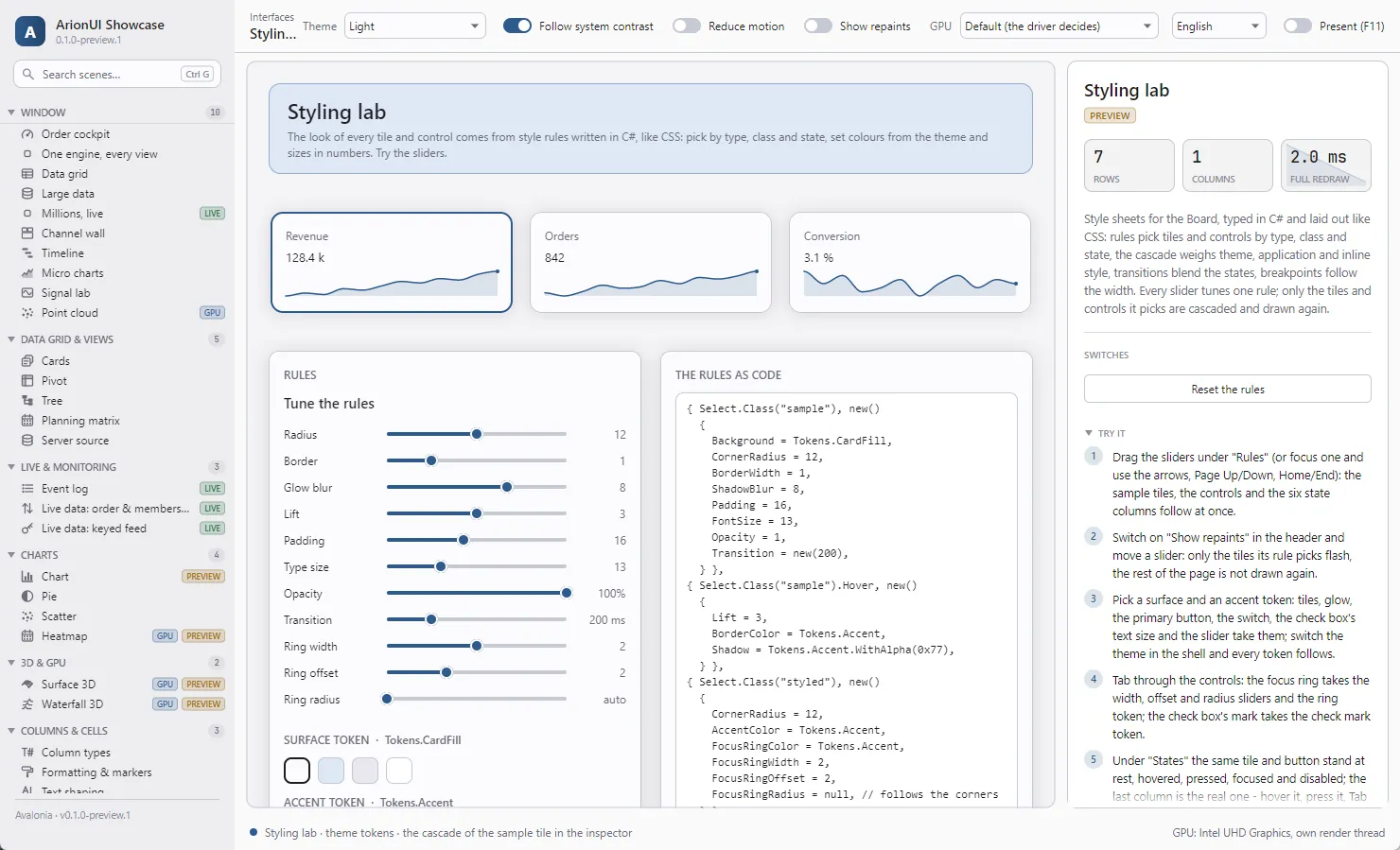
What a style sets
- The box
Background,BorderColor,BorderWidth,CornerRadius,Padding,Opacity.- Depth
Shadow(a colour),ShadowBlur, andLift: a raised tile is drawn over its neighbours.- Text
Foreground,FontFamily,FontSize,FontWeight. On a tile they are inherited by the text inside it — aLabelwithout its own style.- Focus
FocusRingColor,FocusRingWidth,FocusRingOffset,FocusRingRadius— a ring like CSSoutline. Unset, it is the theme's: a hairline in the accent, two units wide in high contrast.- Behaviour
Transition,Cursor,AccentColor(a check box's mark, a switch's track, a slider's fill).
On a tile, box properties draw the box the board puts around the control. On a control they draw the control's own face, and each control documents which properties it takes.
Padding and the text metrics are taken from the rules without a state, so hovering never moves or re-wraps a tile's content. Colours, shadow, lift and opacity follow every state.
Selectors
| C# | CSS | Picks |
|---|---|---|
Select.Class("card") | .card | tiles and controls with the class |
Select.Class("card kpi") | .card.kpi | both classes |
Select.Type<Button>() | Button | controls of the type, or derived from it |
Select.Type<Button>().Class("primary") | Button.primary | both conditions |
Select.Tile | tile | every tile of a board, no control |
Select.Any | * | every tile and every control |
.Hover · .FocusWithin · .Pressed · .Disabled | :hover · :focus-within · :active · :disabled | the element in that state |
A tile's classes come from Add(…, classes: "card kpi"), a control's from its Classes property. All parts of a selector must hold. Two selectors are equal when they pick the same elements — which is how StyleSheet.Set and Remove find a rule.
The cascade
As in CSS, the origin decides before the specificity. The layers, each over the one before (StyleOrigin):
- Theme — the theme's own sheet,
StyleSheet.Default. - Hint — for a control, what it was built with: a button's
Visual, a drop-down'sCornerRadius. CSS calls these presentational hints. - Application — the sheets of the boards around the element (outer first), then its own board's, then those of its board's active breakpoints.
- Inline — for a tile, its own style:
Add(…, style: …)orSetStyle.
Within a layer the less specific rules are laid down first and the more specific over them; among equals, the later one wins. Specificity is CSS's, simplified: every class and every state counts 10, a control type or Select.Tile counts 1 — so Button.primary:hover is 21. Because origin comes first, any rule of the application's sheets, even a bare type rule, wins over the theme's. Each property is decided on its own.
The theme's sheet gives the class card its look — card fill, hairline border, rounded corners, a soft shadow and 16 units of padding — and half opacity to a tile whose control is disabled; a plain tile gets no box. It also gives every control its theme look: a quiet button, with primary and neutral as classes for the other two, the text box, check box, switch, drop-down and slider. StyleSheet.Default is fixed; give the board a sheet of its own.
Theme tokens
A colour or a length in a style is a fixed value or a theme token. A token is read from the active theme each time it is drawn, so a style written with tokens follows every theme switch — light, dark, the high-contrast pair — without being written again.
using ArionUI.Core;                  // Rgba
using ArionUI.Presentation.Controls; // ArionStyle, Tokens, Insets

var accentBand = new ArionStyle
{
    Background = Tokens.AccentTint,                 // follows the theme
    BorderColor = Tokens.Accent.WithAlpha(0x66),
    Foreground = Tokens.Text,
    FontSize = Tokens.FontCaption,
    CornerRadius = 12,                              // a plain number is a length
    Padding = new Insets(20, 12),
};

var brandRed = new ArionStyle { Background = new Rgba(0xC0, 0x39, 0x2B) };   // a fixed colour
The colour tokens are Background, CardFill, CardBorder, Border, HeaderFill, RowHover, SelectionFill, EditBackground, Text, TextDim, TextFaint, ChipText, Accent, AccentTint, AccentDeep, FocusBorder, Shadow, and the status colours Green, Amber, Red, Blue. The lengths are FontBody, FontButton, FontCaption, FocusWidth and FocusRadius. WithAlpha makes a translucent token; Tokens.TryGet("accent", out …) finds one by name. The themes themselves are on Theming.
Transitions
When a tile's state or classes change, it blends into its new look over the Transition of that look. ArionTransition.Fast is 120 ms, Standard 200 ms, Slow 320 ms, None changes at once; a custom one takes a duration and an ArionEasing (Standard, Linear, EaseOut, EaseInOut). Durations go through the grid's animation speed, so the system's reduce-motion setting makes every change appear at once.
Classes and inline styles at run time
board.SetClasses(alert, "card alert");                               // className
board.SetStyle(alert, new ArionStyle { BorderColor = Tokens.Red });  // style="..."
Both blend into the new look over its transition, and both return false when the control has no tile. To tune a rule live — a slider on a radius — use Set, which keeps the rule's place in the sheet:
// A slider on the radius: only the elements this selector can pick are cascaded again.
board.Mutate(() => sheet.Set(Select.Class("sample"), new ArionStyle { CornerRadius = radius }));
The cascade runs when something it reads changes — a rule, a class, a sheet — never per frame: an element keeps its resolved styles, and a changed rule re-resolves only the elements its selector can pick. A sheet changes on the UI thread; change one that is in use inside Board.Mutate.
A top-level board draws in bands of rows that no tile crosses, and a glow is cut at the band's edge, in the middle of the row gap. For a glow that must show whole, keep RowGap / 2 + padding around the tile ≥ 3 × ShadowBlur + Lift. The focus ring is cut the same way.
Explain
What the cascade weighed for an element is a list you can read — the Styles pane of a browser's developer tools, as an API. Board.Explain(control) returns every declaration of every rule that picks the control's tile in its current states, property by property, the winner first and the ones it overrides after it.
foreach (var d in board.Explain(figure))
{
    Console.WriteLine($"{(d.Applies ? "  " : "~~")} {d.Property} = {d.Value}  ({d.Origin}, {d.Selector}, {d.Specificity})");
}
Each StyleDeclaration carries the Property, its Value, the Origin, the Selector (null for an inline style), its Specificity and whether it Applies. For a control's own face, ask the control:
var hovered = save.ExplainStyle(TileStates.Hover); // the same list for a control's own faceStyleSheet.ExplainTile and ExplainControl answer the same question for any list of sheets, classes and states, without a board. The inspector in the “Styling lab” scene is built on them; it is demo code, not a tool that ships.
Planned
Planned For styling
- A validation state on controls: an error text and an Invalid state for style sheets A form has to show which field is wrong and why, in the theme's colours.
No dates: these are decided, not scheduled. The whole list is on the roadmap.