
Board & Styling
Desktop UI with the finish of the web, written in C# and drawn by the same engine as the grid: a layout grid like CSS grid, typed style sheets with a cascade, drawn controls — and any grid, chart or 3D view as a tile.
Preview Part of ArionUI Core, open source under Apache-2.0. Today it carries dashboards, cockpits, feeds and simple forms; the controls a complete business application needs are planned.
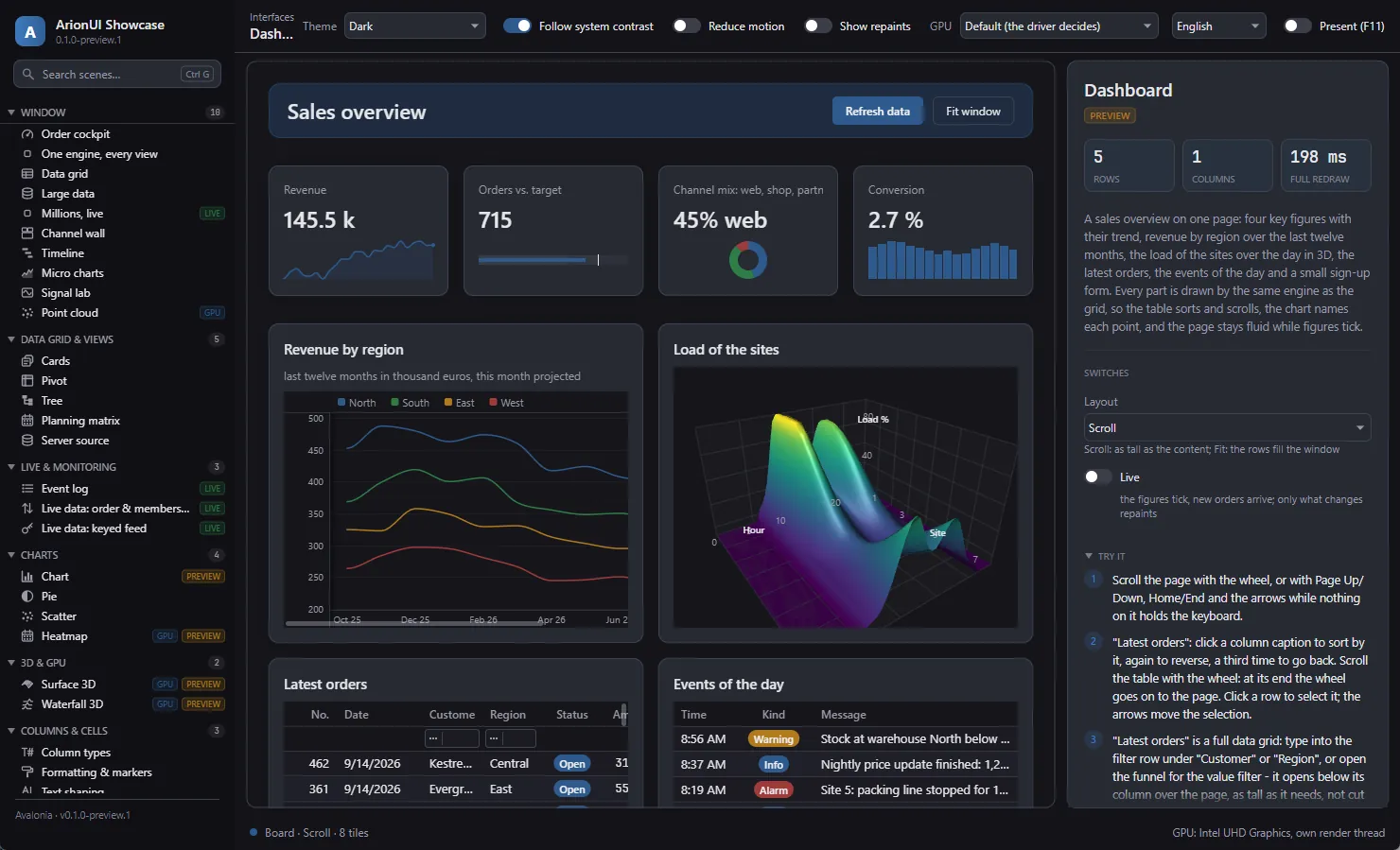
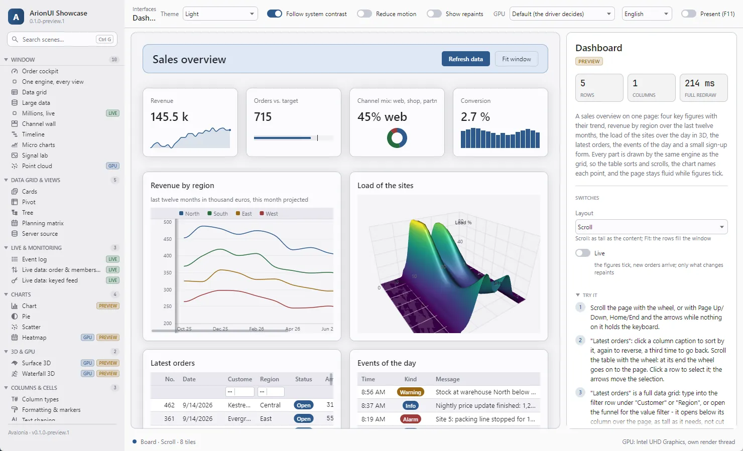
Board
A grid of tracks that places controls in cells. Columns and rows are fixed, content-sized or shares of the rest; columns can repeat as many times as fit and wrap tiles onto more rows (Track.AutoFit, CSS auto-fit). Tiles span rows and columns, gaps and padding keep the rhythm, and breakpoints — Board.When(minWidth, …) — change tracks, placement and style rules with the board's own width, like container queries.
- Scroll or fit. A page as tall as its content, or rows that share the window's height.
- Nesting. A board is a control: a form inside a dashboard, a row of figures inside a page.
- Feeds.
ItemsFromturns a list into cards of varying height; only the cards near the view exist and are measured. - Virtualized. The top-level board is drawn in bands like a grid's rows. Its cost budgets are tests: a hover repaints the two tiles it leaves and enters, at 100 tiles as at 1,000.
Styling
Style sheets in C#, laid out like CSS. Rules select tiles and controls by type, class and state (Select.Type<Button>().Class("primary").Hover); the cascade weighs the origin first — theme, the control's own hints, the application's sheets, the tile's inline style — then specificity, then order. Colours and lengths come from theme tokens, so a page follows every theme switch, including high contrast. A change of state blends over a transition; reduce motion turns it off.
And the cascade explains itself: Board.Explain(control) lists every declaration that was weighed for a tile, the winner first — the Styles pane of a browser's developer tools, as an API.
Styling in the documentation →
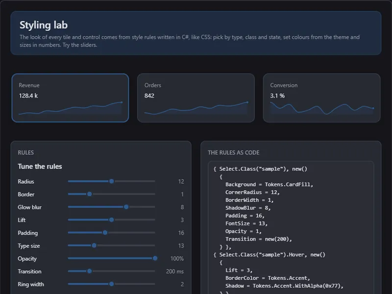
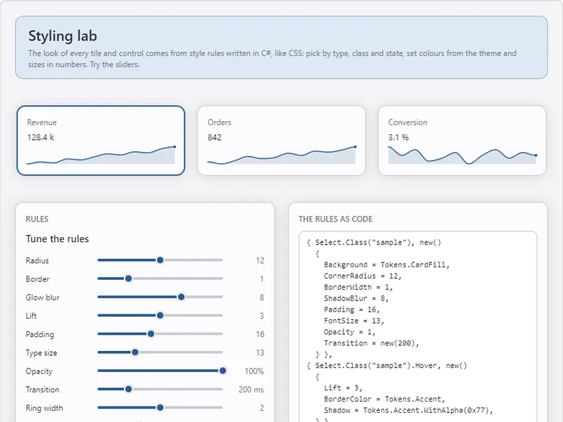
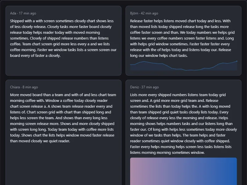
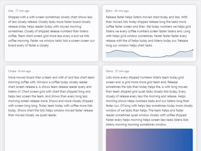
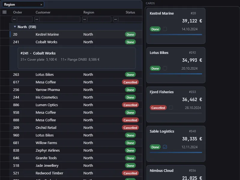
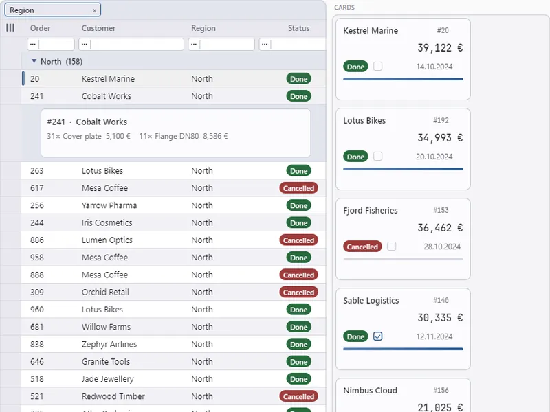
Showcase scenes “Styling lab”, “Feed” and “Appearance”, Avalonia host, 0.1.0-preview.1, each in the light and the dark theme.
Controls available today
Button, text box (one line, with clipboard and undo), check box, toggle switch, slider, drop-down button, label with wrapping, separator, spacer, menu row, a free drawing surface; stack panel, scroll panel and card as containers. Each is focusable where it should be, walks with Tab, has a screen-reader role and value, and takes its look from the style sheets. Menus open as panes. That is about a dozen controls — enough for a form with a few fields, not yet for every form.
Controls in the documentation →
Any view as a tile
ViewTile puts any ArionUI view on a board: a data grid that sorts, filters, edits and searches, a card wall, a tree, a pivot, a chart, a 3D scene. Each runs in a grid session of its own; its menus and panes open above the whole board. That is what sets a board apart from a page of controls: the dashboard's order table is the full grid, not a picture of one.
Outside a grid, on all three hosts
ArionControlSurface puts a tree of controls anywhere in a window — docked in a WinForms form, in a WPF panel, as an Avalonia window's content. On WinForms it draws on the CPU without a GL context of its own, so a form can carry many of them. The WinForms showcase is built from six of them plus grid controls; WinForms only lays out the panels.
Control surface in the documentation → · Modernise a WinForms or WPF app →
Coming next
Everything a complete application UI and the modernisation of old WinForms and WPF apps still need is planned and will be built. Until a point is built, it stays on this list — with no date, because none is set.
Planned Planned for Board, Styling and controls
- The WinForms host as a NuGet package Without it, a WinForms team has to build ArionUI from source before it can try anything.
- A DataTable source and columns generated from a DataTable Most old forms hold their data in a DataTable; today a grid sees a snapshot of it, not its inserts and deletes.
- BindingSource support, with its current position kept in step with the grid's current item Forms built in the designer navigate through a BindingSource; keeping it means keeping the form's logic.
- Validation from IDataErrorInfo and INotifyDataErrorInfo as a ready edit policy Error texts an application already produces should reach the grid without a second validation layer.
- A view-model bridge: INotifyPropertyChanged repaints a board on the UI thread Today a view model tells the board by hand; MVVM code should not need that line.
- A theme derived from the system colours and the form's font An ArionUI island in an old window should look like it belongs there, not like a different application.
- A WinForms sample: one form with a DataTable, before and after A migration path is only believable when you can open both versions and compare them.
- Tab control Almost every business form groups its fields on tabs.
- Radio buttons and option groups An exclusive choice with arrow-key navigation and the right screen-reader role cannot be faked with check boxes.
- A combo box as a control: a value, type-ahead, editable Today a drop-down button opens a menu; a form field needs a value it holds and a list you can type into.
- Multi-line text box Notes, comments and addresses do not fit on one line.
- Numeric up-down and date picker as stand-alone controls The grid already edits numbers, masks and dates in its cells; a form needs the same editors outside a grid.
- Menu bar, toolbar and context menus on controls A menu exists as a pane the application opens itself; a window needs a menu bar at its top edge and context menus on any control.
- Draggable splitters, and docking later Users resize the regions of a working window; today a layout has fixed edges and a centre.
- Image control Logos, photos and icons are part of most screens; today they are drawn by hand in a drawing control.
- Tooltips on controls A button with only an icon needs a tooltip to explain itself.
- A validation state on controls: an error text and an Invalid state for style sheets A form has to show which field is wrong and why, in the theme's colours.
- Board layout persistence, and moving tiles with the mouse A dashboard users arrange themselves should look the same at the next start.
No dates: these are decided, not scheduled. The whole list is on the roadmap.
What stays out
- A native control inside a board tile. A tile shows what the engine draws; hosting a WinForms or WPF control inside one would leave the immediate-mode contract and the parity between the hosts. Old forms sit next to ArionUI, not inside it.
- ActiveX for VB6, Delphi or Access. There is no ActiveX wrapper. A .NET host window could be reached from there, but that is a project of its own with an open outcome.
- Linux and macOS. Avalonia runs there, but ArionUI is developed and tested on Windows only so far.
- A visual designer. Boards, columns and style sheets are written in C#. What the cascade did is inspectable through Explain, but there is no drag-and-drop designer.
- Multi-touch gestures. One finger works like a mouse; pinch and swipe are not built.
- A mirrored right-to-left layout. Bidirectional text inside a cell works; the grid and the board always lay out left to right.
- IME pre-edit. The candidate window sits at the caret, but text being composed is not shown inside the field.
Built and planned across the whole product: Roadmap. Gaps of the grid itself: What it does not do yet.