
Board
A grid of tracks that places drawn controls in cells — XAML's Grid and CSS grid in one, typed in C#. Boards nest, wrap with the width, change at breakpoints and scroll like a page, and any ArionUI view can sit in a tile.
Preview Part of ArionUI Core (ArionUI.Presentation, ArionUI.Grid), open source. The API may still change between preview versions.
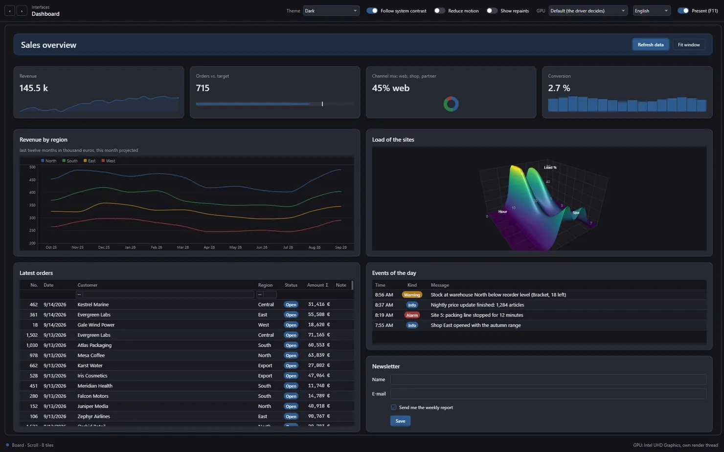
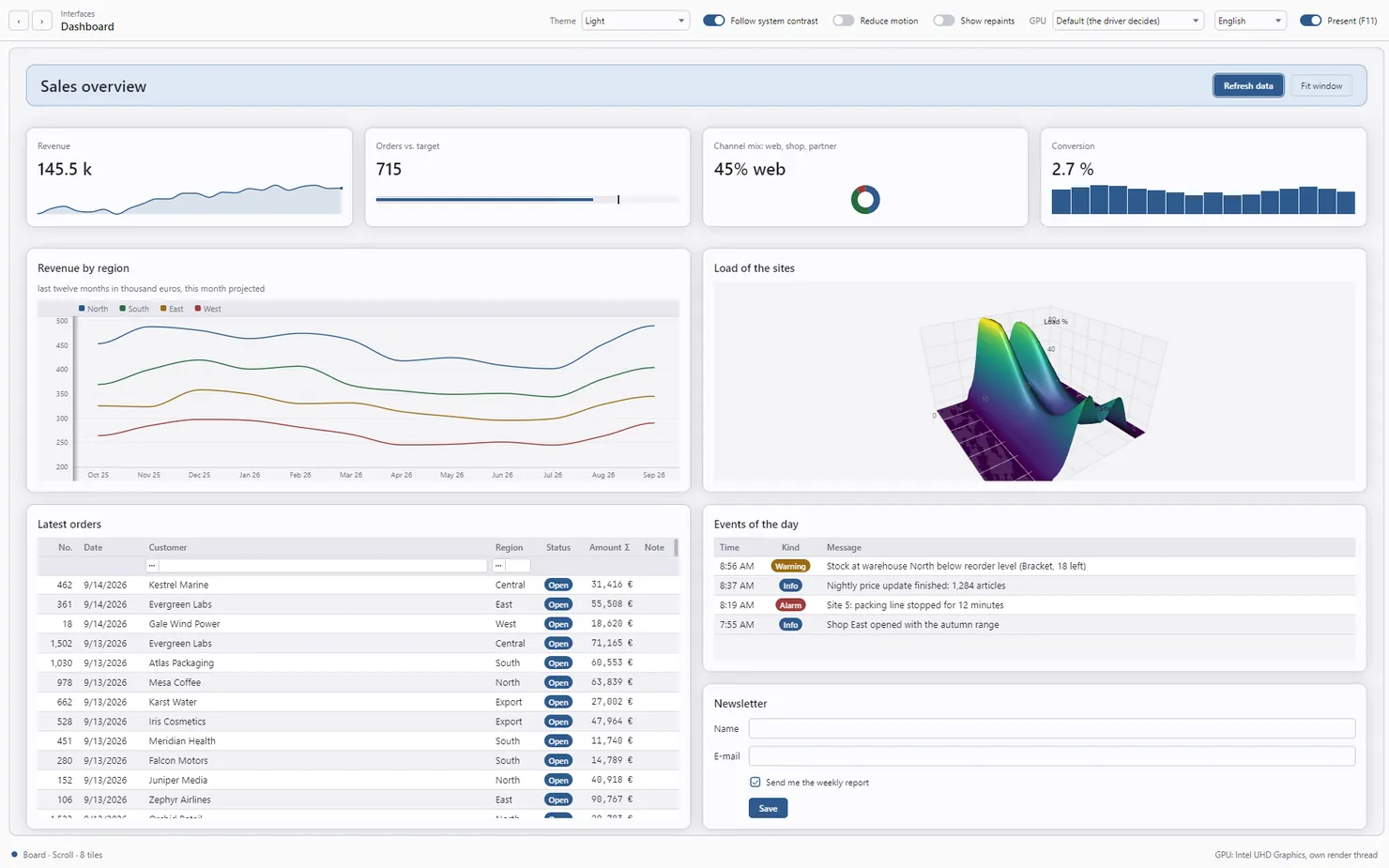
A first board
Columns and rows are lists of track sizes. A tile goes into a cell with Add and may span rows and columns; BoardView shows the top-level board in any grid control, on every host.
using ArionUI.Core;                  // Track
using ArionUI.Presentation;          // BoardView
using ArionUI.Presentation.Controls; // Board, Label, Button, TileAlign

var board = new Board
{
    Columns = [Track.Px(220), Track.Star()],
    Rows = [Track.Auto, Track.Star()],
    ColumnGap = 16,
    RowGap = 16,
    Padding = 24,
};

board.Add(new Label { Text = () => "Orders" }, row: 0, col: 0, colSpan: 2, classes: "card")
     .Add(new Button { Text = () => "Refresh", Click = Refresh }, row: 1, col: 0, vAlign: TileAlign.Start)
     .Add(new Label { Text = () => status, MaxLines = 3 }, row: 1, col: 1, classes: "card");

// ArionGrid on Avalonia or WPF, ArionGridControl on WinForms
grid.MainView = new BoardView(board);
Add and Flow return the board, so tiles chain. Its other parameters are rowSpan, colSpan, hAlign and vAlign (TileAlign.Stretch, Start, Center, End), a margin, the tile's style classes and an inline style. Tiles on rows or columns beyond the declared tracks get implicit auto tracks.
WinForms, WPF and Avalonia each have their own Button, Label, TextBox and CheckBox. Build boards in files that do not import the host's control namespace, or alias ArionUI's: using Drawn = ArionUI.Presentation.Controls; — that is what the WinForms showcase does.
Tracks
var board = new Board
{
    // fixed, content-sized, and two star columns sharing the rest 2:1
    Columns = [Track.Px(240), Track.Auto, Track.Star(2, min: 160), Track.Star()],

    // a header as tall as its content, a body that takes what is left (BoardMode.Fit)
    Rows = [Track.Auto, Track.Star(min: 200)],
};Track.Px(size)- A fixed size in logical units.
Track.Auto,Track.AutoBetween(min, max)- As large as the content needs, optionally clamped.
Track.Star(weight, min, max)- A share of the leftover space, in proportion to the weight. Where there is nothing left to share — a board that scrolls on this axis — a star track takes its content size like an auto track.
Track.AutoFit(min, balance)- As many columns of at least
minas the width holds, sharing it evenly; tiles the board places itself wrap onto more rows as it gets narrower — CSSrepeat(auto-fit, minmax(min, 1fr)). Withbalance: truethe rows come out even: four as four or two by two, never three and one. Track.AutoFill(min)- Like
AutoFit, but empty columns stay, so a tile keeps its width however few there are — CSSauto-fill.
Measuring follows XAML: auto columns from their tiles, then star columns share the width, then auto rows are measured at the width of their tiles, then star rows share the height. Only columns repeat, and at most one track rule per board may repeat. ColumnGap, RowGap and Padding keep the rhythm; Padding takes an Insets, and a single number converts to the same space on every side.
Wrapping with the width
Flow adds a tile the board places itself, in reading order, into the first free cells — CSS auto-placement. Over an AutoFit column it wraps:
var kpis = new Board
{
    // CSS: repeat(auto-fit, minmax(185px, 1fr))
    Columns = [Track.AutoFit(min: 185, balance: true)],
    ColumnGap = 16,
    RowGap = 16,
};

foreach (var kpi in figures)
{
    kpis.Flow(new StackPanel { Gap = 4 }
        .Add(new Label { Text = () => kpi.Caption })
        .Add(new Label { Text = () => kpi.Value.ToString("N0") }),
        classes: "card kpi");
}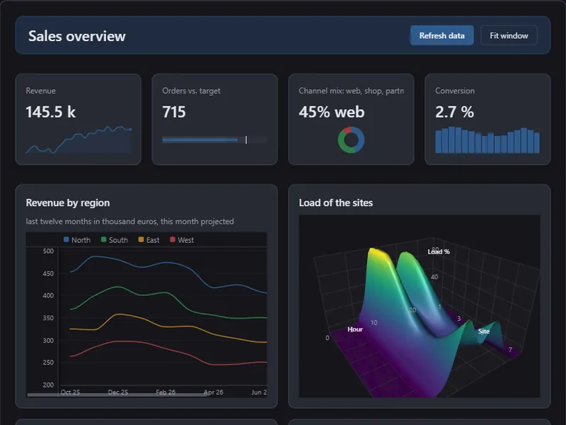
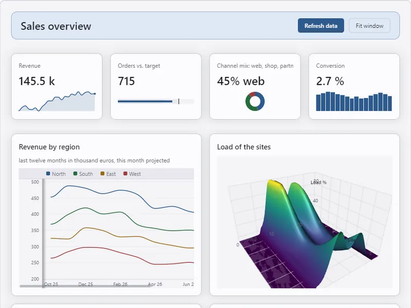
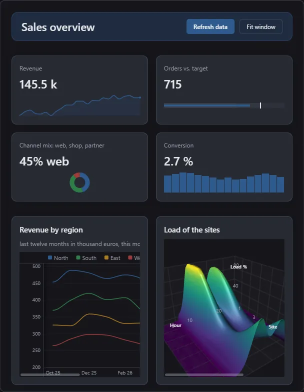
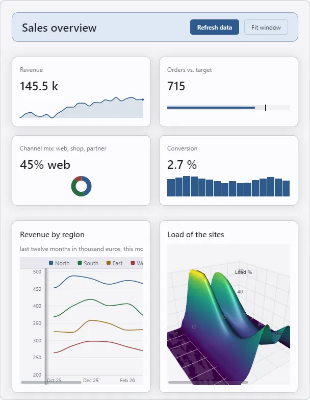
The “Dashboard” scene at the showcase's normal window size and in a narrower window. Avalonia host, 0.1.0-preview.1.
Breakpoints
When(minWidth, configure) is CSS's @media (min-width: …), measured on the board's own width — the window's for the top-level board, its tile's for a nested one, like a container query. While the board is at least that wide, what the breakpoint sets applies: other tracks, gaps or padding, tiles placed elsewhere (Place, Flow) or hidden (Hide), a style sheet of its own. Breakpoints apply in the order they were added, a later one over an earlier: start narrow, add wider.
var page = new Board { Columns = [Track.Star()], RowGap = 16, Padding = 16 }
    .Add(header, row: 0, col: 0)
    .Add(content, row: 1, col: 0)
    .Add(sidebar, row: 2, col: 0)
    .When(minWidth: 900, wide =>
    {
        wide.Columns = [Track.Px(260), Track.Star()];
        wide.Padding = 24;
        wide.Place(header, row: 0, col: 0, colSpan: 2);
        wide.Place(sidebar, row: 1, col: 0);
        wide.Place(content, row: 1, col: 1);
    })
    .When(minWidth: 0, maxWidth: 480, narrow => narrow.Hide(sidebar));
The width is compared at every layout, but the breakpoints are applied again only when it crosses a threshold. The “Styling lab” scene uses two of them on its own page: one column below 700 units, two from 700, three from 1060.
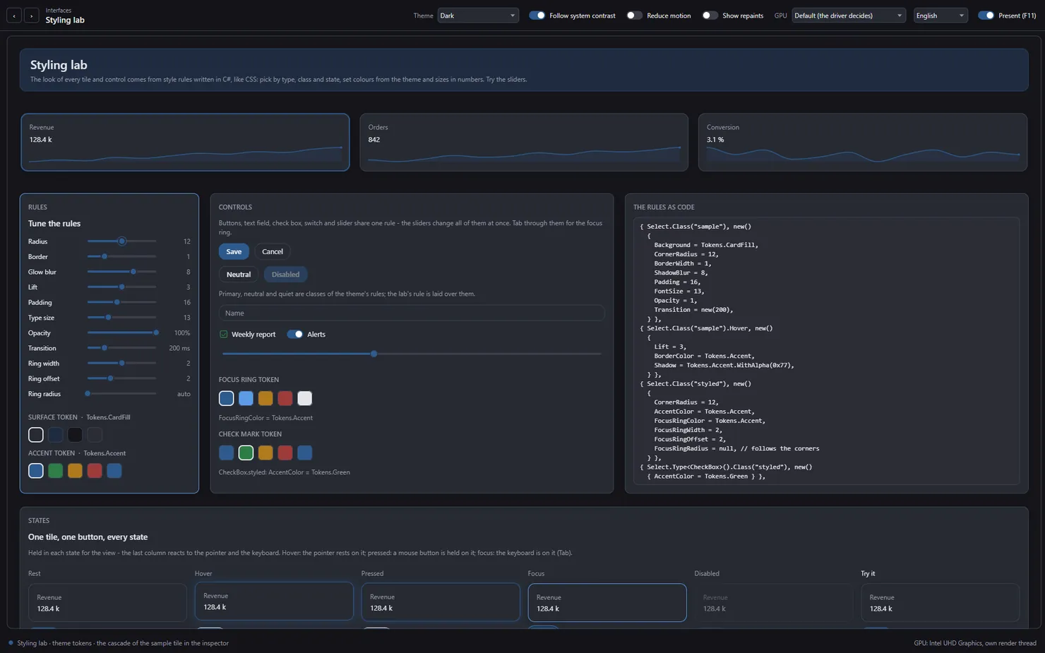
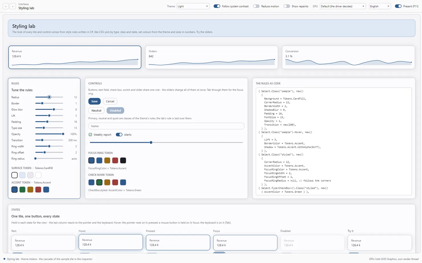
When(minWidth: 1060, …) breakpoint lays the sections out in three columns. In the normal window it shows two. Avalonia host, 0.1.0-preview.1.Scroll or fit
A top-level board in BoardMode.Scroll (the default) behaves like a web page: as tall as its content, and it scrolls; star rows take their content size. In BoardMode.Fit it fills the window and star rows share the height left over; when their minimums do not fit, the minimums win and the board scrolls after all.
// star rows share the window's height
board.Mutate(() => board.Mode = BoardMode.Fit);
Nesting
A board is a control, so a tile can hold another board — a form inside a dashboard, a row of figures inside a page. A nested board fills the height its tile gives it, and inherits the style sheets of the boards around it.
var form = new Board
{
    Columns = [Track.Auto, Track.Star()],
    ColumnGap = 12,
    RowGap = 10,
}
    .Add(new Label { Text = () => "Name" }, row: 0, col: 0, vAlign: TileAlign.Center)
    .Add(name, row: 0, col: 1)
    .Add(new Label { Text = () => "E-mail" }, row: 1, col: 0, vAlign: TileAlign.Center)
    .Add(mail, row: 1, col: 1);

// a board is a control, so it goes into a tile like any other
page.Add(form, row: 4, col: 2, colSpan: 2, classes: "card");
Any view as a tile
ViewTile (in ArionUI.Grid) puts any ArionView on a board: a data grid, a card wall, a tree, a pivot, a chart, a 3D scene, another board. The view runs in a grid session of its own, so a table in a tile is a full grid — sorting, the filter row and its value filter, editing, column drag, resize and pinning, search with Ctrl+F — and its panes and menus open above the whole board, not cut at the tile.
var orders = new GridView<Order>(
    [
        Column.Text<Order>("Customer", o => o.Customer).Sortable(o => o.Customer).Fill(),
        Column.Text<Order>("Region", o => o.Region).Sortable(o => o.Region).WithWidth(90),
    ],
    GridItemsSource.From(Orders),
    rowHeight: 26)
    .WithFilterRow();

board.Add(new ViewTile(orders)
{
    Height = 360,
    AccessibleName = () => "Latest orders",
}, row: 3, col: 0, colSpan: 2, classes: "card");
A view that needs a GPU can bring WithoutGpu, a control shown instead where the surface has none — decided per frame, from the first frame on. For a screen reader, a table in a tile is a table: the tile is the table part, its headers, rows and cells are parts inside it. A board with view tiles is shown by a grid control through BoardView; for controls alone outside a grid, see Control surface.
For a single cell element outside a table — a sparkline, a donut, a bullet chart, a progress bar — there is ElementTile, on the Controls page.
Feeds
ItemsFrom makes a board a feed: one card per item, flowing into the board's columns, each row as tall as its tallest card. Only the cards near the view exist; a card that leaves goes back to a pool for the next item. Only those items are measured — the rest count as the mean of the measured ones until they come into view — and positions come from a Fenwick tree.
var feed = new Board
{
    Columns = [Track.AutoFit(min: 340)],
    ColumnGap = 12,
    RowGap = 12,
    Padding = 16,
}
    .ItemsFrom(posts, () => new PostCard(), (card, post) => card.Show(post), classes: "card");

grid.MainView = new BoardView(feed);
For an ObservableCollection the board listens itself. For any other list you tell it: ItemsInserted, ItemsRemoved, ItemsChanged, on the UI thread. When items arrive above the view, the view stays on the item the user reads. A feed board holds no other tiles and is the top-level board of a BoardView; FeedStats says how many items are measured and how many cards exist.
Changing a shown board
Once shown, a board changes on the UI thread only. Its own changes — tiles, tracks, properties — re-lay it out by themselves. What the tiles draw, the application's values and texts, changes inside Mutate, so the render thread never reads a half-made change:
// On the UI thread. The board compares the tiles near the view before and after,
// repaints what changed and lays itself out again if a tile needs other room.
board.Mutate(() => revenue.Value = latest);
Up to ExactLayoutLimit tiles (500 by default) every change measures every tile again. Above it, only the tiles near the view that changed are measured, so a change costs the same on a board of any size; a tile out of view is measured when it scrolls in. Mutate(control, change) measures one tile at once, wherever it lies. From another thread, Mutate throws: hand the data to the UI thread first.
The top-level board is drawn in bands and virtualized like a grid's rows. The board's cost budgets are tests that count rather than time: a hover repaints the two tiles it leaves and enters and nothing else, at 100 tiles as at 1,000. The showcase has a stress scene with up to 10,000 figure cards.
Keyboard and screen readers
Tab walks the tiles in reading order — row, then column — and scrolls each into view. A tile reads as a group when its control has an AccessibleName and holds parts, or when it holds several parts and opens with a text, which then names the group. Controls carry their roles and values. See Controls.
Planned
Planned For the board
- Board layout persistence, and moving tiles with the mouse A dashboard users arrange themselves should look the same at the next start.
No dates: these are decided, not scheduled. The whole list is on the roadmap.
Missing controls — tabs, radio buttons, a combo box, splitters — are listed on Controls. Styling is on the next page: Styling.