
Charts
ArionUI.Charts · free during the preview, also commerciallyLine, area, column, stacked and waterfall series on one or two axes, built from a model or from cells the user selected in a grid. A chart is a view like the table, so it goes into the same control.
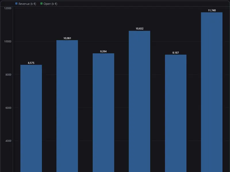
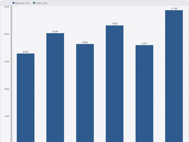
Install
dotnet add package ArionUI.Charts --prereleaseConstructing a chart view, or calling one of the chart extensions on grid.Api, switches the module on.
A chart from a model
A ChartModel is categories plus series. Each ChartSeries has a name, values, a kind — Line, Area, Column, Waterfall — and optionally a colour, an axis, a stack group and, for a waterfall, which bars are totals.
string[] weeks = ["W1", "W2", "W3", "W4", "W5", "W6"];

var model = new ChartModel(weeks,
[
    new ChartSeries("Revenue", [48_000d, 51_500, 47_200, 55_900, 58_100, 54_300], ChartSeriesKind.Column),
    new ChartSeries("Margin %", [21d, 23, 19, 24, 26, 22], ChartSeriesKind.Line,
                    axis: ChartAxis.Secondary),             // its own scale on the right
]);

var chart = new ChartView(model);
chart.Definition.LegendPosition = ChartLegendPosition.Bottom;
chart.Definition.ShowDataLabels = true;
chart.Definition.Curve = SparklineCurve.Monotone;
chart.CategoryClicked += click => Log($"week {weeks[click.Category]}: {click.Value}");

grid.MainView = chart;
Series on ChartAxis.Secondary get their own scale on the right, for two units in one plot. Configuration goes through chart.Definition: legend position, data labels, line curve, step width per category (the zoom), a navigator strip, a 3D depth for columns, and an optional TimeAxis that places points at their real time.
new ChartSeries("North", [20d, 22, 19], ChartSeriesKind.Column, stackGroup: "total");
new ChartSeries("South", [11d, 9, 14], ChartSeriesKind.Column, stackGroup: "total");

new ChartSeries("Result", [120d, 340, -150, -95, 0], ChartSeriesKind.Waterfall,
                totals: [false, false, false, false, true]);   // the last bar stands on zero
Columns with the same stackGroup stack, and the scale reaches the stack's total. In a waterfall every bar starts where the previous one ended; a bar marked as total stands on the baseline.
A chart from a grid selection
The user marks a category column and one or more number columns; the chart module turns the selection into a model. A value column qualifies when it declares a summary value — .Summable(…) or .Summary(fn, value) — so the same declaration carries the footer sum and the chart. A typed number column without one does not.
// Mark a category column and one or more number columns, then:
if (grid.Api.ChartFromSelection() is { } built)
{
    grid.MainView = new ChartView(built.Model);   // built.WasTruncated: the category limit cut rows
}

// Or offer "Show as chart" in the cell context menu:
IDisposable menu = grid.Api.EnableChartMenu(result => grid.MainView = new ChartView(result.Model));
Both calls take a category limit (60 by default); ChartBuildResult says how many categories were selected and how many made it in. Where the chart appears — the same control, a panel, a dialog — is the application's decision. Disposing the result of EnableChartMenu removes the menu entry again.
Streaming
var signal = new StreamingChartSeries("Signal", capacity: 10_000);
var live = new ChartView(new ChartModel(10_000, [signal]));

// on each tick, on the UI thread:
live.Append(0, [0.42, 0.44, 0.47]);   // series 0; the oldest points fall off
A StreamingChartSeries is a fixed-capacity buffer: appending pushes the oldest points out, and the chart redraws without a new layout. Build its model with the point count, not with one label per point.
Pie, scatter, heatmap
var pie = new PieView(new PieModel(
[
    new ChartSlice("North", 42),
    new ChartSlice("South", 31),
    new ChartSlice("West", 27),
]));

var scatter = new ScatterView(new ScatterModel(
    [new ScatterPoint(1.2, 3.4), new ScatterPoint(2.0, 2.9)], label: "Measurements"));
HeatmapView takes a HeatmapModel(values, columns, rows). Each view has Update(model) for new data.
Drawing
Lines and areas are drawn on the GPU by default (ChartRendering.Gpu) and fall back to the regular surface by themselves where the GPU cannot run; axes, labels, columns and the legend are drawn by the surface either way. Definition.Rendering = ChartRendering.Surface draws everything on the surface. Long series are thinned to what the plot width can show.
The "Show as chart" menu text is German by default; ChartUiText.English() switches it.